NEWS! The Observer chose Pattern-book (out 29 May in the UK and 31 July in the US) as its May poetry book of the month. So surprised and thrilled. You can read Jade Cuttle’s review here.
One of the questions I have gotten the most is “how did you get such a good cover for your book?”. My books do have great covers. I have had the benefit of working with excellent book designers (Mary Austin Speaker at Milkweed and Andrew Latimer, who is in fact the managing editor at Carcanet. Both Mary and Andrew are also poets!) Book designers are a resource you can’t overestimate. They read your book, understand what it’s doing, understand the market (how to sell a book right now, not just how to make a good-looking cover), understand the history of design. They are specialists in their field, which is why, like professional editors and copyeditors, they are indispensible. (It’s a rare writer—specialised in making texts as art!—who is also a professional and specialist in the history and present of book design and visual marketing and book cover design and has time for that, and has the detachment necessary for editing their own work. This is why publishing, even small-small publishing, even “self” publishing, is always a collaborative venture. We need one another! No single genius, and no isolated homestead in art. Village model all the way.)
So the short answer to the question about great covers is, I had great designers. And the slightly longer answer is, I am reflective about what I like, why I like it, what it signifies, where that signification comes from, and I have my own extensive history of looking at objects, books, and images—which is not a small part of how I make poems, actually—that informs how I think about my books as objects. And the much longer answer follows.


When I’m putting a book together, because of how I am, I generally have a visual sense of the book. I know what images recur across it. I have a color sense for the book as a whole. I also look at book covers all the time (because I read books but also because I keep an eye out for them). So as I’m going from the broader, less-focused time of poem-making and data-collecting toward the more narrowly focused time of book assembly, I am asking myself: what kind of book is this? And how (how many ways) might that express itself in terms of visual conventions?
During this process I make notes and collect images. I send these to the book designer once they let me know it’s time to begin work. I also try to write up what it is that draws me to the images, and provide links to covers that do things I like (with reasons). I’m thinking about composition, color, typefaces, overall “feel”, etc. I also try really hard not to be attached to one particular (or one category of) imagined cover. Partly this is because when I do design work I hate the feeling that someone else is hovering over me, trying to move the cursor. But also it’s because the book designers I’ve worked with have always surprised me with something that is better than what I could have imagined alone. Trusting them—and preparing them to understand how I see my book—is the best foundation.
Here’s the other thing: I decided pretty early on that the book cover being something I could stand behind mattered a lot to me. (It may not to other writers. Everyone has their own priorities.) That wasn’t an easy thing to decide. I never like to cause conflict or tension. But when a book designer (not named in this post!), early on in my writing life, sent me a book cover that missed everything about my book and appropriated some elements of visual/material culture that had nothing to do with my book or life, I thought, either I can say yes and not feel uncomfortable for doing something polite or I can say, no, sorry, but absolutely not that, and feel uncomfortable but actually be able to hold the book up at readings and feel good about it. So I wrote back and politely but firmly made my (brief) case and articulated a few other possible roads based on the book. The book cover ended up being both beautiful and really clearly evoking the book’s contents and ideas. And I felt good about being clear with the designer.
When it came to working on The Century, I had the benefit of Mary Austin Speaker’s huge expertise and also her enormous patience. Early on, I sent her images of William Kentridge’s work as well as a few prints by Otto Dix and other WWI-era artists to think about. I wanted something that would feel a little rough, a little historical, and also gesture clearly to the book’s questions about the intersections between imperialism, capitalism, and white supremacy. (Mary did probably twenty different mock-up covers in the process of thinking about the book—really above and beyond.) In the end, we couldn’t get permissions for any of the images either Mary or I had found. She suggested looking for historical photographs, and I found a few in a Belgian archive. She chose one—the one that is on the cover—cropped it, set the text, and it was so perfect for the book I gasped when I saw it. I could not have imagined this cover; it was nothing like what I was thinking when the process began. But Mary had seen it and had worked in service of that vision, and she was right. It was and is an evocative, visually interesting, conceptually fitting cover for the book.
When Carcanet acquired Pattern-book, the author survey included questions about covers I liked as well as thoughts I had about possible cover directions. I included Thomas A. Clark’s Farm By The Shore and links to Laurie Clark’s drawings—one idea I had was to have a grid of her buttercup or harebell drawings—as well as links to public domain images of actual pattern books in collections like those at the V&A. I made some drawings, too.
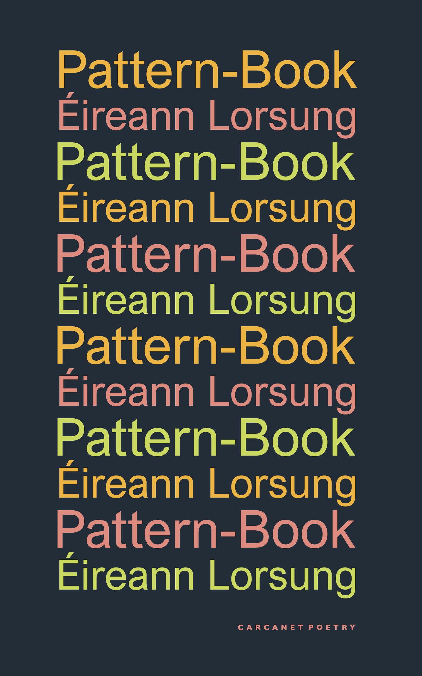
In the early fall, Andrew Latimer emailed me with a draft cover. He noted in his email that the cover had taken a very different direction from anything we had talked about. And it had! Here’s the first version of the cover.
I liked it. It was, as often is the case, like nothing I had imagined. And yet the design Andrew had sent really hit some important things about the book! It got that the book is about repetition, it captured my interest in things that are more or less the same but just a little different. It was visually striking and it didn’t do the thing poetry book covers too often do, which is make a book that’s neither "winsome” nor “sentimental” feel a little of both. But there were two things that felt off to me. First of all, I couldn’t quite get my mind around my own name repeating on the cover. Totally personal—as in totally to do with my own feelings about authorship and being public and taking up (what kind of) space. And then there were the (striking!) colors used for the text. I liked them, but they didn’t feel quite right. The book uses a few color words very deliberately, over and over. Those color words are tied to specific images that recur both across individual poems and also across the entire manuscript. And the colors of Andrew’s design were very different to those colors. So I mocked up a version with slightly different colors and with text that reversed every other line and sent it off.
Andrew came back with a version that developed on my proposal (but again, was better than what I had mocked up). He explained his choices—not reversing the word avoided the awkward backward ‘k’, for example. He also adjusted the progression of colors in my rough version. And that was it—there was the book cover! I loved how striking it was, and how plain, and how the colors were yet another kind of ‘easter egg’ in the book which is full of hidden patterns and self-samples.
The process I’ve been through with the book designers at the presses who’ve published my work has been specific to small/independent presses. Most writers who publish through major houses do not get to be so involved in the design process, and I feel lucky to have had input into my books’ covers. I’ve benefited from and am really grateful for the patience and openness to collaboration that the designers I’ve worked with have shown me. And I’m especially grateful for the beauty and perceptiveness and intelligence of their work which has done so much to support my own.
LAUNCHES! Carcanet will host a Zoom launch on May 28 (the day before the UK publication date) at 7 p.m. UK time (2 p.m. US Eastern). You can register for that here. I’ll be in conversation with Jon McGregor and also, I hope, with you! There is a small admission charge from the publisher which, if you’re in the UK, can be redeemed against the cost of the book if you purchase it after the launch. Or, before the 29th and again only if you’re in the UK, you can order Pattern-book from the Carcanet website and use the code ELPB15 for 15% off of the cover price and free UK shipping. You can, in the UK, also order from Sam Read Booksellers or from your local indie, or ask your local library to get a copy.
LAUNCHES! If you are in Dublin or nearby, please come to the Gutter Bookshop on June 5 at 6:30 p.m. and help me launch this book in style. I will provide the cake. Please bring a short poem you love that uses a received form or strong repetition, in whatever language.


LAUNCHES! There will be some readings elsewhere! Where? When? We will see! Please put some information into this form and I will email you. Thanks to all who tolerated a recent mass email. I promise those will be few and far between.
LAUNCHES! Actually no, not launches. NORTH AMERICAN PREORDERS! You can do that at your local indie, or do it at my local indie, which is the wonderful Moon Palace Books. For PREORDERS IN THE UK AND IRELAND please see the Carcanet site or ask at your local independent bookshop. See above for some satisfied customers/preorderers, including a sharp critic (shared w/ permission) whose review is that there are “no pictures of babies” and “so many words” in Pattern-book. Incisive! Accurate!
Thanks for reading, thank you for pre-ordering, and thank you, if you choose to, for sending the cost of a book instead to the Palestinian Children’s Relief Fund.


i love seeing these covers and hearing your process. as i just sent some notes about a cover this fees so very very very spot ont.